BRAND IDENTITY AND STRATEGY:
Value Add Renewables
Logo, Icons & Web Presence for a Clean Energy Startup in Louisiana
Key Objectives:
-
Create a clean, credible logo for a new consultancy
-
Develop custom iconography to highlight services
-
Design business cards and basic brand usage
-
Launch a simple website (Wix) to support credibility & client acquisition
Tools Used:
-
Adobe Illustrator
-
Figma
-
Wix
Value Add Renewables is a clean energy consultancy focused on helping property owners maximize renewable energy ROI. I created the logo, iconography, and business cards and launched a simple informational website to establish their professional presence and support early outreach.

Design Outcomes At-a-Glance:
-
Created a bold, emblem-style logo with a restrained palette designed for high-impact
-
Designed and launched a lightweight, SEO-informed website with a supporting icon system
-
Extended the brand into print collateral, including business cards

Discovery and Direction:
Value Add Renewables required a brand identity that conveyed professionalism, technical expertise, and trust—while remaining approachable and grounded. It also needed to differentiate itself from other "green" energy consultants in an increasingly competitive field.
The company's target audience included landowners and business decision-makers across the Gulf South, many of whom were interested in investing in renewable energy infrastructure but needed reassurance that the process would be financially sound, straightforward, and tailored to their needs.
Keywords shaping the brand included solar energy, battery backup, project management, auditing, consulting, and tax-aligned financing.
Logo Development:
Zeroing in on the word add and its immediate visual potential, I began exploring the plus sign and other mathematical symbols as structural and conceptual anchors. My process was driven by digital experimentation—adjusting type treatments, spacing, and alignment to find a mark that felt technical, direct, and scalable. Once a black-and-white form was solid, I introduced simple color, landing on a red, black, and white palette that reinforced the brand’s clarity and construction-forward tone.
Final Logo and Web Icons
The final mark is a bold, badge-style emblem designed for clarity and versatility. Its square form communicates structure and precision, while its simple color palette reinforces the brand’s connection to utility, construction, and directness. I developed the brand to look equally strong on business cards, hard hats, or trucker hats—anchoring the brand with both professional and blue-collar credibility.
,
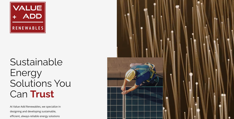
After the logo was complete, I created a lightweight website to give the company a clear, professional presence during early outreach. I wrote site copy, structuring the content around local SEO priorities that would help increase visibility in key Gulf South markets.
To reinforce key service categories, I designed a set of six custom icons to use in conjunction with the copy. Characteristic elements of each icon match the width of the plus sign in the logo, creating an extra level of subtle cohesion across the brand system.
Deliverables
-
Logo
-
Color scheme and typographic system
-
Custom web icons
-
SEO-informed website
-
Full website copy
-
Business cards
Final Direction and Client Use Outcomes:
The client was pleased with the project's outcome and has continued to expand the brand beyond its initial launch. After the site went live, Value Add Renewable re-engaged me to extend into print collateral and merchandise, including business cards for the founding team. The goal is to continue developing a consistent and precise visual language for the brand as it expands its public profile and client base.


